Master of his domain
- Details
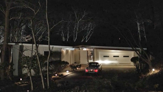
You know (or maybe you don’t) how in Masters of Sex, Bill and Libby live in a groovy, modern, suburban, architect-designed, low ranch-style house in St. Louis?
Well, here’s where they really lived. In the well-to-do suburb of Ladue, where everyone has simply acres of lawn. Click through to Google Maps for a Street View gander.
350-year-old sparrows
- Details
The University of Cambridge Library has recently digitized this fragile book, reputed to be the world’s oldest example of multicolour printing. Perversely the image I’ve chosen is monochrome, but hey I like sparrows!
Dating from 1633, the Ten Bamboo Studio Manual of Painting and Calligraphy (十竹齋書畫譜 Shízhúzhāi Shūhuàpǔ) contains around 320 prints by 30 artists including the printer himself, Hu Zhengyan (胡正言 Hú Zhèngyán) and was intended as a showcase as well as a primer.
(Windows) 7 out of (Windows) 10
- Details
So, I ended up installing Windows 10 instead of 7 and it did a much better job of detecting hardware. It even downloaded NVIDIA drivers (not the latest) and set a sensible resolution.
To get SLI working though I had to open Task Manager & kill the shell Explorer process, otherwise NVIDIA Control Panel just complained about things which you can’t shut down needing to be shut down. Tedious and took quite a bit of fiddling about with Services before I realised it was mainly Explorer.
There have been a few spectacular crashes, by which I mean a sustained whine through the speakers and a completely black screen requiring a hard reboot, but on the whole it’s OK. Definitely some rough edges and I do wonder if it will really be ready for release in a month’s time, but it could be worse!
Apparently Windows Update will use something like Bittorrent to distribute updates, so if other computers on your network already have the update it won’t have to be downloaded again. Very sensible idea which will save bandwidth, but I’ll bet they over-complicate it.
The most striking thing about Windows 10 is its almost brutalist pursuit of a plain, flat look. After years of pursuing ever more elaborate 3D illusion, it seems flat is where it’s at. Flatness has had its devotees in the Linux world for a while (Exhibit A: Libra GTK 3 theme, Exhibit B: Super flat remix icon theme), so maybe this is another case of Windows trying to grab some geek chic?
The only concession to graphic processing power is a drop-shadow around the window. Even the window corners are square and somehow make me think of paper cuts. It’s all teetering on the edge of cleverly understated and downright ugly.
Microsoft Edge (still badged as Project Spartan in the preview—see pic above) is a nice attempt at a simpler browser to fit in with this aesthetic, but as a Firefox user it offers me nothing compelling.
Another thing that sticks out is that familiar Microsoft feel of yet another bolted on layer. Windows is an accretion of software over many years now and it makes for a sometimes less than consistent whole. It’s particularly obvious coming from 6 months of using only Ubuntu. Now Linux (& Unix) is entirely made up of bits, but because a lot of those bits have to work with other bits that can be interchanged, these days you end up with a pretty consistent look and feel whether it’s in the Ubuntu Unity, GNOME or KDE desktops. But Microsoft often have a problem getting their older components to look consistent with newer styles.
This was very apparent when I tried using the scaling slider (something GNOME has had for some time) in Display Settings. Incidentally, this is another example of inconsistency—there is now a Settings ‘app’ as well as the plethora of Control Panels, so you have two places to look for settings. The default text size is pretty small on my 1920×1200 monitor, so I bumped it up to the next available (125%). The text in new apps looked deliciously crisp, but in old apps (e.g. Device Manager) the text was bloated, black and blobby. It seems the Windows family has its favourite children.
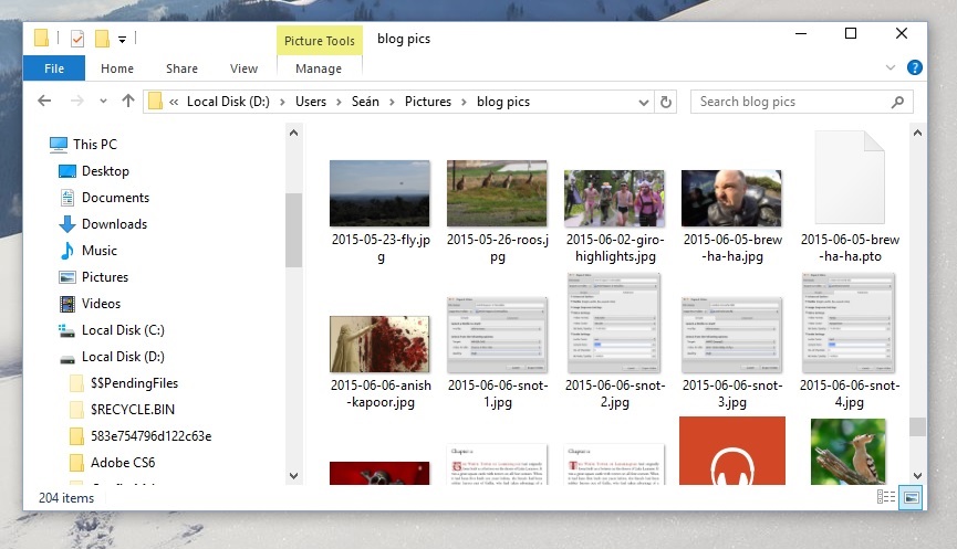
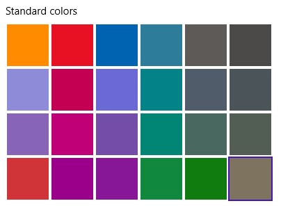
In trying to make some screenshots for this post, I encountered another small oddity which is either suggestive of the minds behind this kind of design or a sign of the general dumbing down that convergence (writing software for desktop & mobile) brings. I thought I’d set a background colour that showed up the window drop shadow and went to Display Settings. Unfortunately you can only choose from ‘Standard Colors’ and though I vaguely remember there being a customisation options in the old Personalization Control Panel (i.e Themes), that’s now been disappeared. So the only ways to choose a simple coloured background of your choice is to create an image that colour and set it as a background or edit the registry with the RGB colour value.
Ah Microsoft, the more you change the more you stay the same!
Not an insect on my washing
- Details
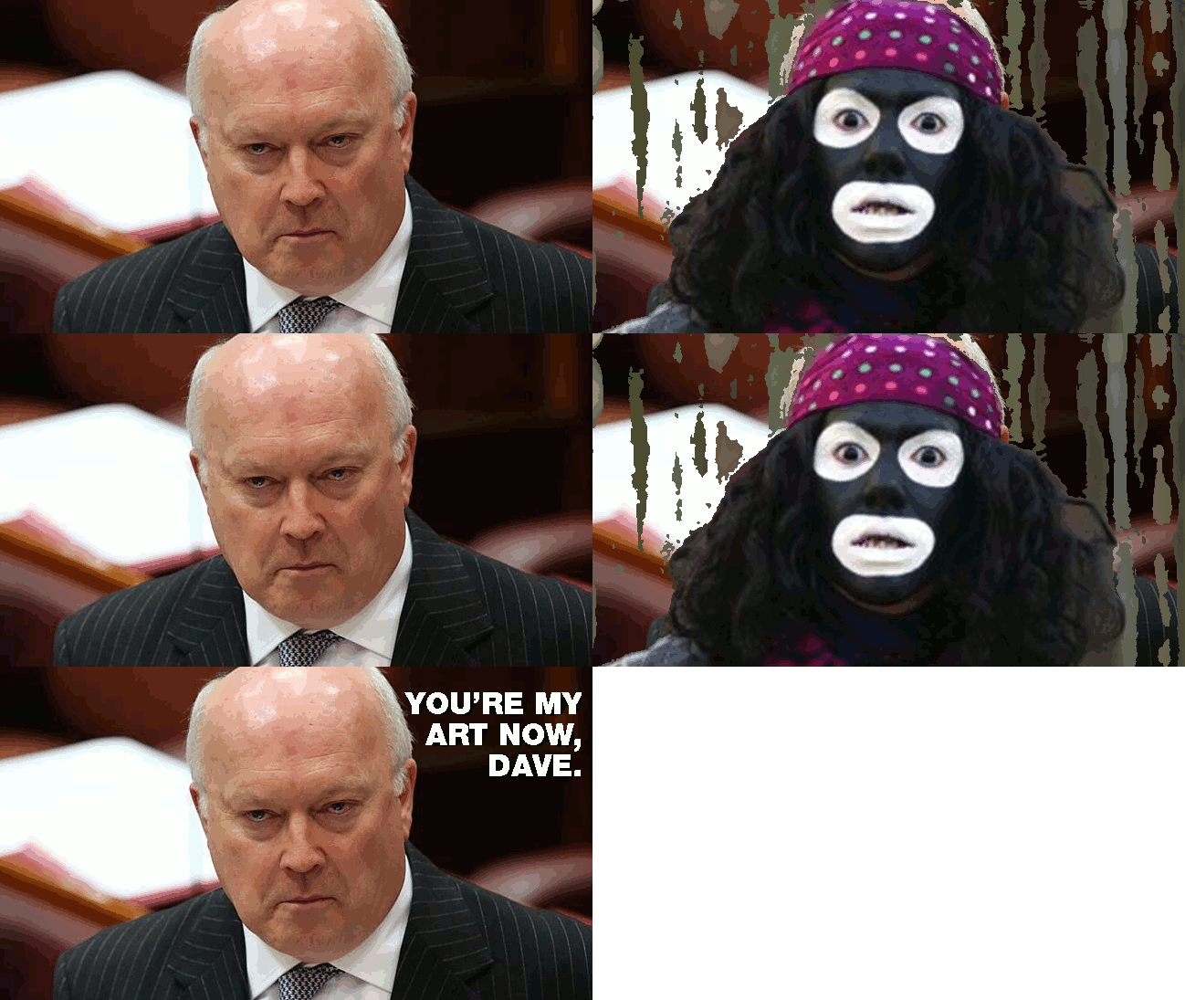
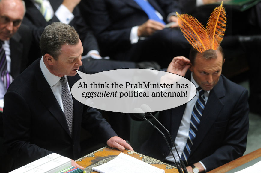
The PM’s Xmas Massage
- Details
My more abstract edit of this may never be finished, so in the meantime there’s this.
Page 5 of 6
