The world of ePublishing is pretty confusing. Competing standards, competing devices and even more variation in quality than you’d ever see in print. It is difficult negotiating all this and yet remaining compatible with a wide range of devices. I am probably more, ahem, discerning than the average punter—I’ll happily edit an ePUB if I don’t like its style—but putting aside my particular preferences, I think (in 2014) there are some basics that you should expect from an electronic edition.

The Complete Works of Laurence Sterne
First, a small digression (can you tell I just finished reading Tristram Shandy?). While there have been a bewildering number of e-book formats, there are two that remain as the main contenders today: MOBI (& its descendants) and ePUB.
MOBI, while not originally developed by them, is Amazon’s proprietary format, whose main purpose seems to be to keep you embedded in the Amazon purchasing universe. It has tweaked and updated versions, but it basic form is just that...basic. It’s also fairly closed off—there are programs that can manipulate the content of MOBI files, but it’s not a simple thing. You’re really meant to produce your content externally then import it into the format which acts like a black box. If you need to change something you need the source files.
By contrast ePUB is a free and open standard developed by the International Digital Publishing Forum, a trade standards association. Where MOBI uses HTML plus extra stuff invented by Amazon, ePUB uses a fairly strict subset of HTML and CSS—i.e. it uses easily available and open standards, not ad hockery that changes with each new device. Of course it’s not quite that simple as the most common rendering engine used in devices (and the one with Digital Rights Management) is made by Adobe, so you pretty much have to use Adobe’s implementation of the standard. The other contrasting feature of ePUB (in its non-DRM form) is that it uses that ubiquitous compression format, ZIP. Yes all ePUB files are just ZIP files under another name. If it’s not copy protected you can open it up and access the files that make up the book.
So, bearing all that in mind, you can see that it is in publishers’ interests to try to leverage the vast marketing power of Amazon and, often, that ends up being their main focus. Negotiating the rendering and coding differences between the original Kindle and the latest Amazon tablet can be time consuming and exhausting, so it’s not surprising that often ePUB versions are an afterthought and even the MOBI versions aim for a very low common denominator. This is very sad, because (even though I think ePUB is superior) both formats can produce exquisitely beautiful books.
Now, getting back to my original thread, what are the basics that I expect? There are really just two main things.
1. Parity
When I buy an e-book I expect to get a reasonably faithful reproduction of the printed book. It doesn’t have to be exact, but I really don’t want to feel like I’m missing out or being treated like a second-class citizen. If it has illustrations, give me illustrations. If it has fruity Ancient Greek quotations, give me those quotations—don’t give me something like [Greek] instead, which one edition of Tristram Shandy had the cheek to do. There isn’t always an easy solution, but there will be a solution.
2. Use the format, damn it!
Both formats are HTML based so you can add value to the text and make it easier to navigate by using things like links. Both formats also have ways of encoding a table of contents to make it easy to get around. Both formats have ways of designating page breaks (not something that makes sense in HMTL on the web). Not using these basic elements of book structure is just unforgivable and yet it happens!
A bad example
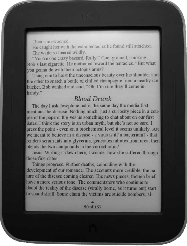
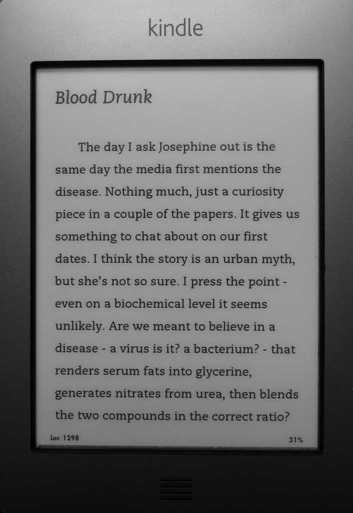
The other day I bought an ePUB of Adam Browne’s ‘Other Stories’, and Other Stories from newcomer Satalyte Publishing. I really enjoyed his phantastical Pyrotechnicon and, although I did give it a nicer font and fiddle with the illustrations a little, the original formatting by coeur de lion publishing was perfectly fine. Imagine my shock then, to find that Other Stories didn’t even have a table of contents, page breaks between chapters, any of the illustrations (apart from the cover), proper chapter headings (it uses minimally formatted <p> tags rather than <h1>) or any kind of margins. This last point is debatable, but most readers let you change margins anyway and (in ePUBs at least) they can be set in a sane way.
Since Neil has the MOBI edition on his Kindle, I thought I’d compare. While the ePUB is obviously the least loved child here, the MOBI isn’t getting exactly smothered either!
Beginning of a story (ePUB)
Beginning of a story (MOBI)
Same story, different display (MOBI)
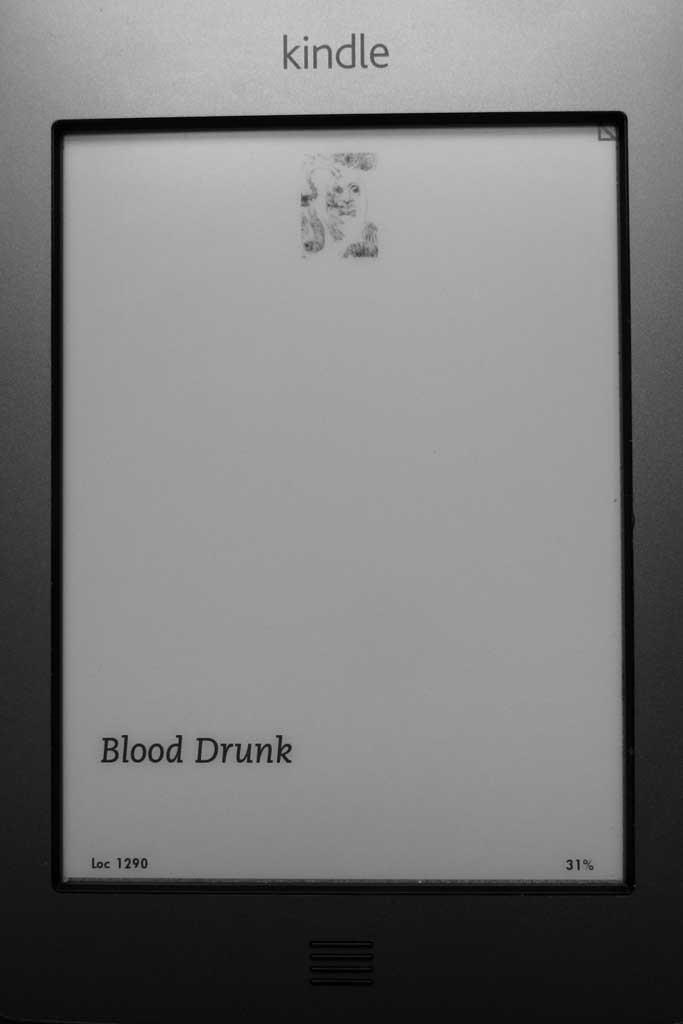
But then sometimes even in MOBI the start of a story can look like this (revealing the end-of-story illustrations missing from the ePUB). These illustrations are a bit too small in any case.
I’ve seen this kind of thing before with MOBI and although I suspect there is a solution, I’m not sure what it is. With ePUB the simplest solution is just to make each story a separate file, which is good practice anyway as it improves performance on older devices. This book only has two XHMTL files—one for the cover and one for all of the text.
§
Now, what does the Table of Contents show us?
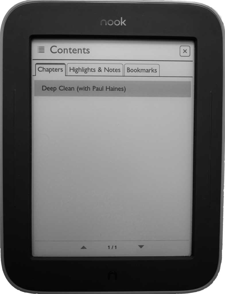
Not so helpful (ePUB)
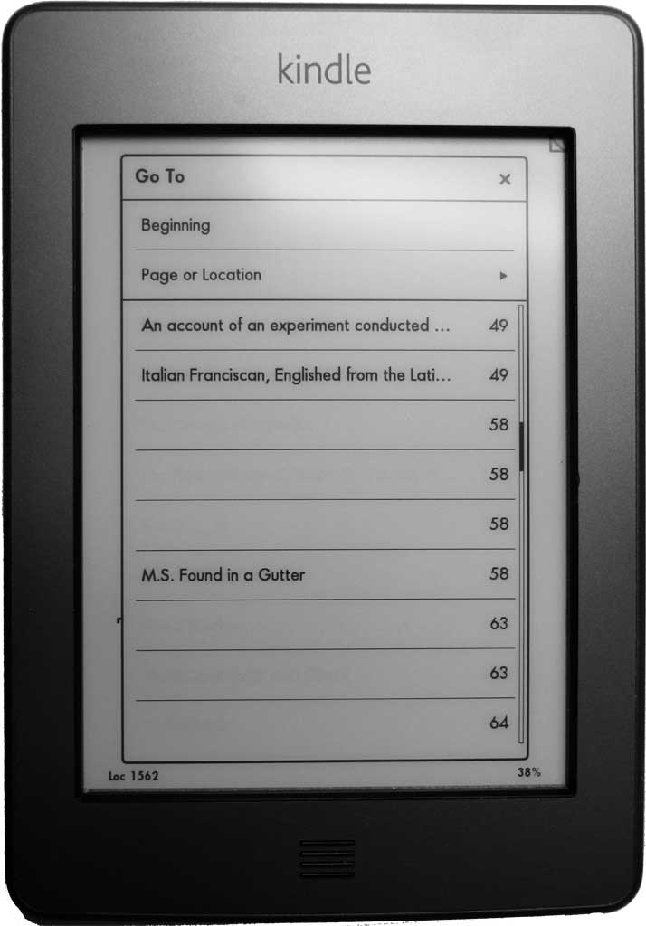
Empty lines caused by bad TOC entries (MOBI)
The narrative line
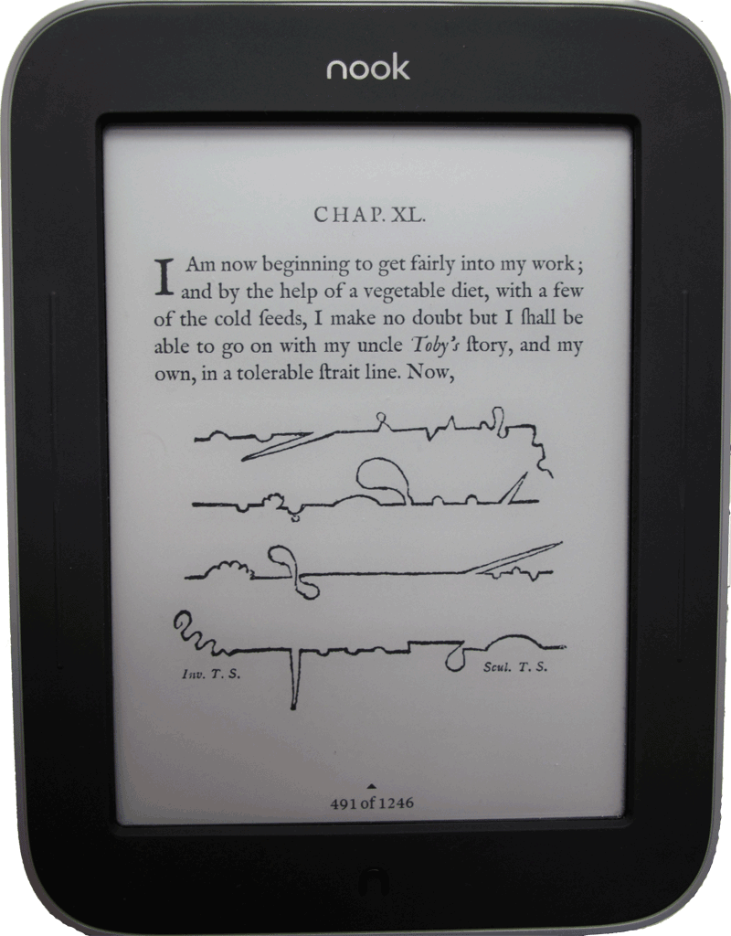
I don’t know, maybe I’m spoilt after reading Tristram Shandy in such an excellent edition of the Complete Works of Laurence Sterne (by pynch form the mobileread forums). It’s available in two editions: an 18th century edition complete with all the ligatures, long esses and a font mimicking the printing of the time; and a 21st century edition. It manages to display a good deal of the idiosyncrasies of Sterne’s work and there certainly are plenty of those—blank pages, marbled pages, empty chapters and diagrams representing the progress of the work to date.
It just seems to throw the flaws in what should be a relatively straightforward piece of formatting into even starker relief.